Web & UI Documentation Guide
This internal resource is your go-to guide for building and maintaining web pages that look, feel, and function like Elisity. Whether you're launching a new page or updating an existing one, this toolkit ensures consistency, efficiency, and brand alignment at every step.
Use this guide to build with confidence, scale with clarity, and keep every touchpoint unmistakably Elisity.
The Neambo Act3 theme remains the foundational framework for the Elisity website.
All global settings such as typography, color palettes, spacing, and component styles are configured within this theme and will automatically apply to any new pages built using it.
The custom theme, “Elisity_2025”, is a child theme built on Neambo Act3.
1.21 Neambo Act3 Support Documentation
Click here to view the Neambo Act3 Documentation.
The “Act3 Documentation” page on Neambo provides a comprehensive guide to using the Act3 HubSpot theme. It includes sections on Getting Started (setting up, theme options like headers, footers, blog setup, etc.) and Modules (detailed descriptions and settings for each component—buttons, galleries, forms, navigation, etc.)
Note: This is a great place to look when the current Elisity_2025 Theme documentation does not answer all your questions.
To support design goals and evolving web needs, the child theme, Elisity_2025, was built on top of the original Neambo Act3 framework. This allows for the development of custom modules and layouts while preserving the integrity of the core theme. This setup gives the flexibility to customize while keeping the foundation stable and scalable.
The current Elisity website is built with a combination of legacy pages from Neambo Act3 and custom pages that utilize the custom theme, Elisity_2025.
Content Outline
Section 1 - Background
1.2 Neambo Act3 & Custom Elisity_2025 Theme
Section 2 - Custom Modules & Saved Sections
2.3 Finding Custom Modules & Saved Sections
Section 3 - UI Styles, Components & Assets
Section 4 - Global Theme Settings
4.1 What is a theme in Hubspot?
4.2 Global Content - Navigation & Footer
Section 5 - Troubleshooting, Common Fixes & FAQ
1.22 Theme Structure & Breakdown
Theme: Neambo > Act3 (overall styling and system)
- Child theme: Elisity_2025 (customized version of the theme)
- Page: (what the user sees) pages include webpages: Home Custom 2025 and Platform Custom 2025
- Section (divides the page)
- Module (content and functionality)
- Saved Sections (aka a pre-populated modules with ready-to-use content)
- Module (content and functionality)
- Section (divides the page)
- Page: (what the user sees) pages include webpages: Home Custom 2025 and Platform Custom 2025
Theme Page Settings
- Max width: 1312px
- Side padding (desktop): 32px
- Side padding (mobile): 16px
Note: If pages built remain in the original theme, global settings (typography, colors, spacing, etc.) must be consistently updated in both the parent and child themes to ensure all pages, regardless of which theme they're built with, adhere to the same design system.
1.23 Elisity_2025 Theme Webpages
The following website pages have the Elisity_2025 theme applied:
- Home Custom 2025
- Platform Custom 2025
- Solutions (11 total)
- Use Case_Network Asset_Discovery
- Use Case_Network Visibility
- Use Case_IoT Segmentation
- Use Case_OT Segmentation
- Use Case_IoMT_Security
- Use Case_Zero Trust Microsegmentation
- Use Case_Network_Segmentation_Compliance
- Use Case_Block Lateral Movement - Ransomware & Malware
- Industries_Healthcare_Institutions
- Industries_Manufacturing
- Industries_Commercial_Enterprise
- Integrations_Overview
- LANDING PAGE TEMPLATE 2025
Custom modules are reusable building blocks created specifically for the Elisity_2025 theme. They’re designed to match Elisity’s brand style and functionality, making it easy to build pages that feel cohesive without needing to code.
Each module controls a specific type of content, like testimonials, feature sections, or stat blocks, and can be easily added, edited, or rearranged within HubSpot's drag-and-drop page editor.
Custom modules only appear on pages using the Elisity_2025 theme.
Note on Module Backgrounds and Borders
Due to global theme spacing settings, applying a background directly to a module can cause unintended visual padding, often showing up as a 32px border around the module.
To fix this:
-
Remove any background applied at the module level
-
Apply the background to the section that contains the module instead
This ensures alignment with global spacing rules and prevents layout inconsistencies across pages.
Below is the complete list of Modules (21) in the Elisity_2025 Theme:
- Homepage Hero 2025
- Featured News Section 2025
- Eyebrow Text 2025
- Logo Village 2025
- Card Reveal Section 2025
- Rotating Testimonials 2025
- Rotating Feature Section 2025
- Product Capabilities Section 2025
- Product Tour Section 2025
- Compliance Section 2025
- Resources Section 2025
- Stats Card 2025
- Footer CTA 2025
- CTA 2025
- Partner Logo Cards 2025
- Blog Card Slider 2025*
- Bordered Image 2025*
- Integrations Section 2025*
- Laddered Image Text 2025*
- Laddered Video Text 2025*
- Platform 2025*
All modules in the full list end with “2025” for easy identification and searching within HubSpot.
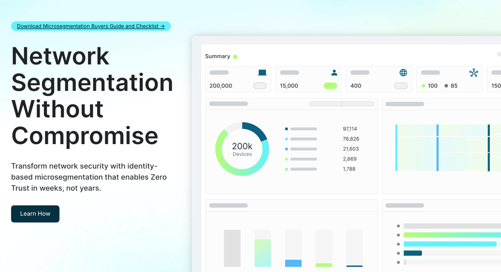
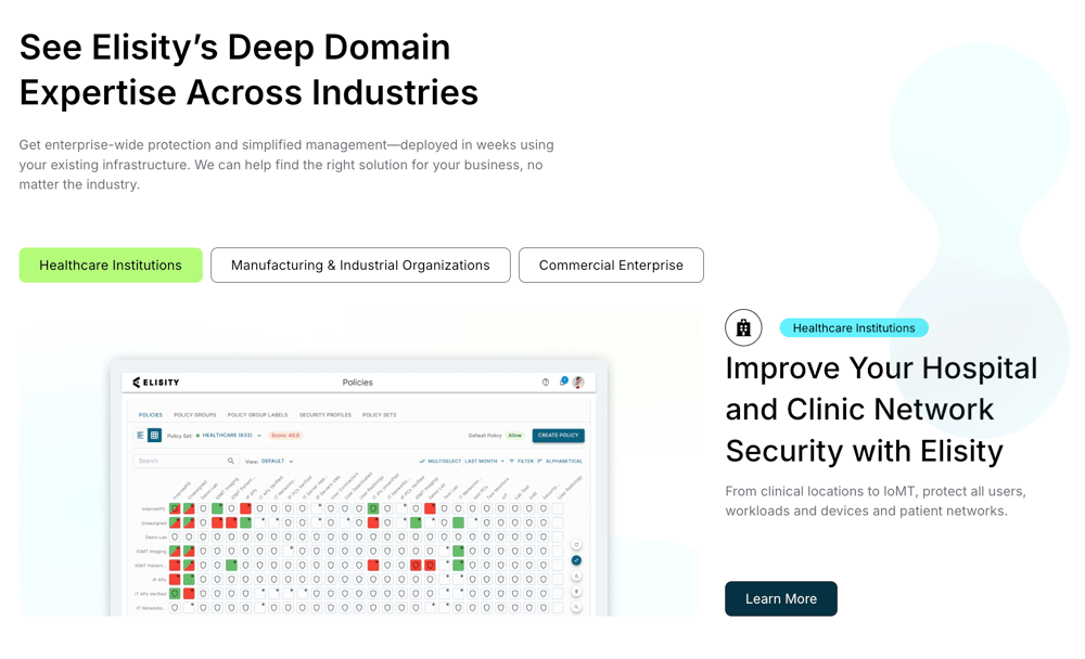
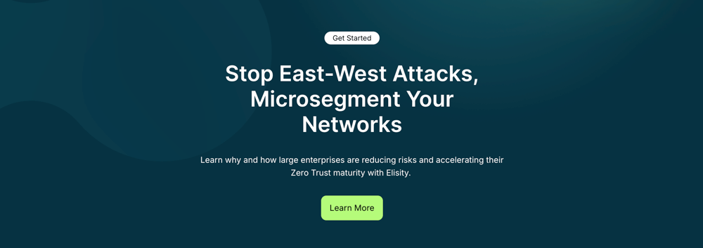
Primary header module: Includes a linkable eyebrow, headline, subhead, CTA and split ½ and ½ with an abstracted product shot.

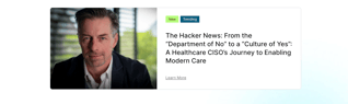
News card section with editable content-type tags, headline and image, and interactive CTA link.

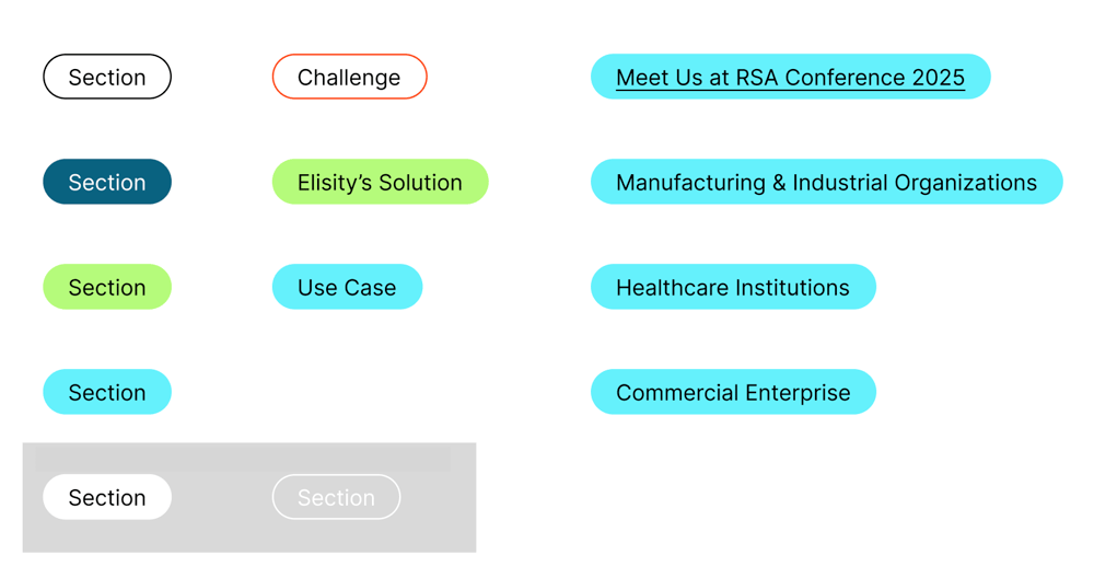
Pre-headline label. Pre-determined fill and outline colors can be changed in the drop down menu when eyebrow is selected.

Partner/client logos displayed in a row.

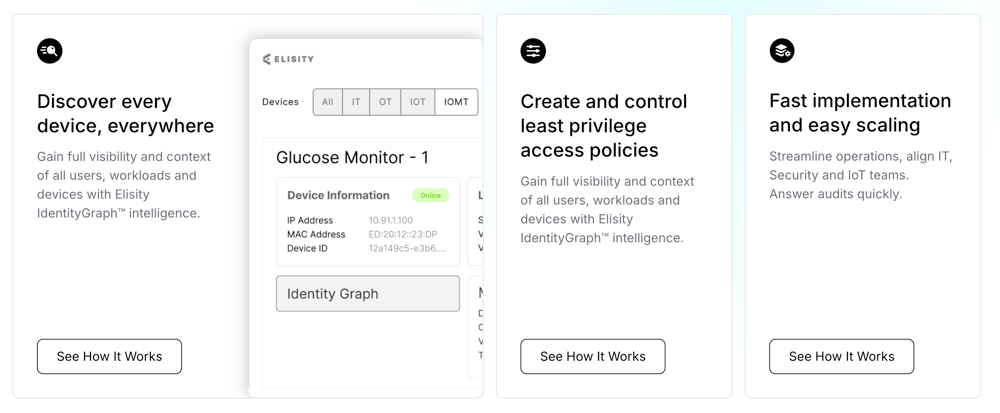
This module displays interactive cards that reveal more content and an image when hovered over or selected. Each card includes a headline, optional icon, body copy, CTA, and an image.
The layout is flexible, but adding too much text can cause spacing issues or make the image appear misaligned.
⚠️ See FAQ: Why does the image look weird or have extra white space?

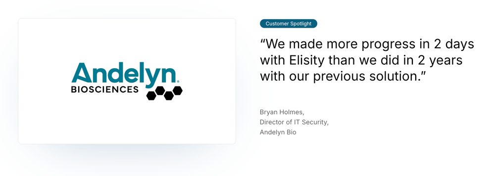
Quote/testimonial-driven layout with logos, image, and CTA that reveal other sets of info on hover. Eyebrow defaults to white outline. Background cannot be set at section level.

Rotating feature highlights with image, text, and CTA button that rotates when users hover on a featured button. Background must be applied to the section. Add content manually or use Saved Section to pre-populate.

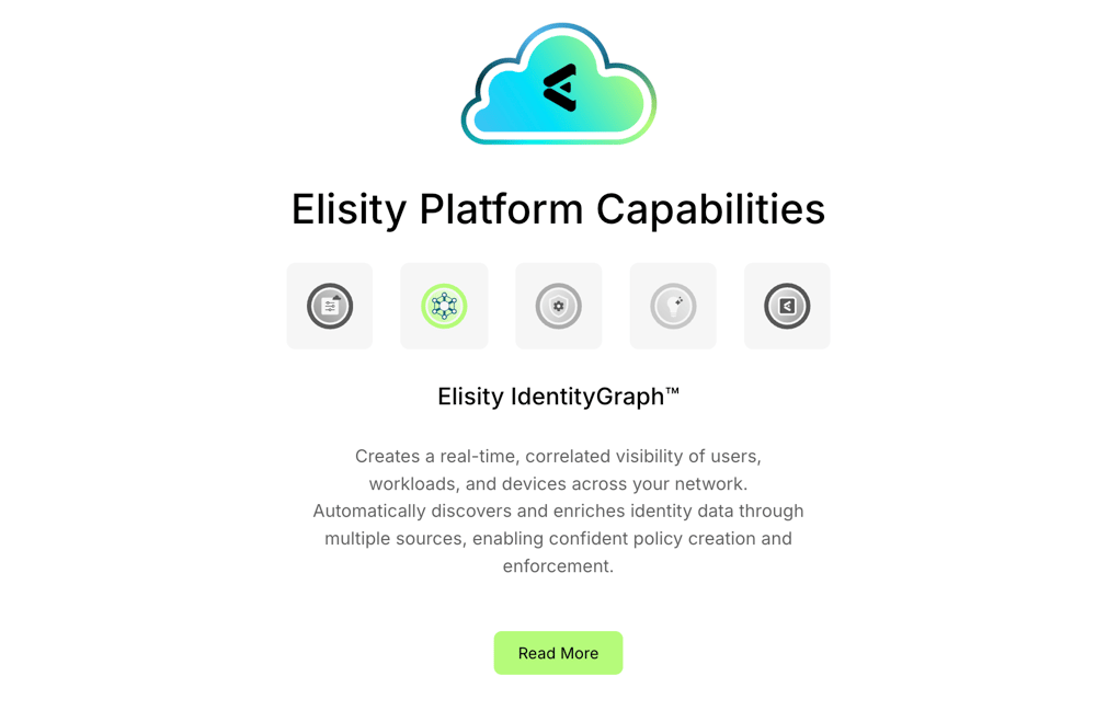
Blocks with icons and product feature descriptions. Include an icon that has hover effects, and text and CTA button. As needed, add featured callouts in the module.

Dark module that has a a product dashboard image, text, and CTA button to product demo.

Grid layout showing compliance standards with CTA button, images, and compliance logos. Logos/icons optional and can be added directly in module.

Grid-based image and text cards that have image and text, and a small underlined interactive CTA link.
Note: Please test image sizes before updating images, as images will get cut off if not set to the right dimensions. Large: 1:2 ratio, Small 2:1 ratio

Set of 4 responsive cards that highlight numbers or metrics. Currently live on the Platform page.

Bold CTA banner above footer with headline, dark branded background, and CTA button to request a demo. Background image must be applied at the section level.

Includes a styled button used for calls-to-action. Commonly placed in hero sections, modules, or split layouts. Button text, link, and color can be customized.

CTA Text guidelines
Good: See How it Works
Basic: Learn More
“Learn more” is vague and overused, while “See how it works” is clearer and gives the user a reason to click by setting an expectation for what they'll see.
The Card Reveal Section module employs these practices, encouraging users to explore further.
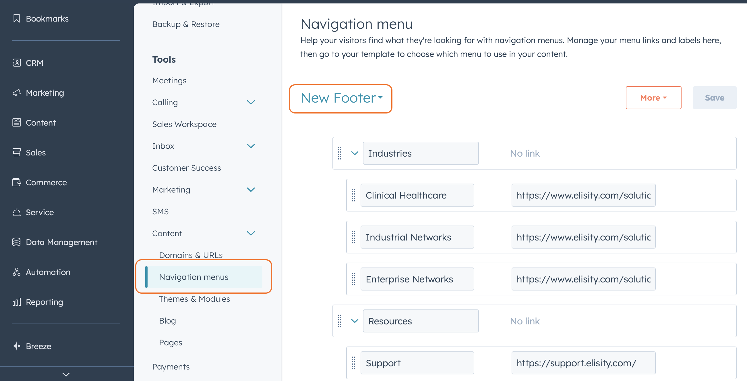
Navigation and Footer. Footer description, featured image, social icons, footer content edited in global themes. Footer page list is edited through Settings → Navigation Menus → New Footer (Drop Down Menu)


Think of Saved Sections as ready-to-use modules saved for quick reuse. They are ready-made content blocks, like CTAs, feature grids, or testimonials, that you can drop into any page and customize.
Important Note:
When possible, start with Saved Sections for pre-populated modules rather than building from blank modules. These sections are editable and ensure faster, more consistent page building.
Like custom modules, saved sections only appear on pages using the Elisity_2025 theme.
Below is the complete list of Saved Sections (12) in the Elisity_2025 Theme:
- Customer Spotlight
- Downloadable Asset
- Featured News
- Rotating Testimonial
- Platform Capabilities Rotating
- Product Tour Section 2025
- Ladder Video Content
- Industry Cards [Static Version]
- Resources 2025 - Top Resources
- Footer - CTA
- Center Call-To-Action Section
- FAQ Section


Creating a New Saved Section
If you find yourself repeatedly creating the same group of modules together, like a header followed by a text block and CTA, you can save time by turning that configuration into a Saved Section of your own. To do this, hover over the section in the HubSpot editor, click the dropdown icon in the floating toolbar (as shown in the screenshot). 
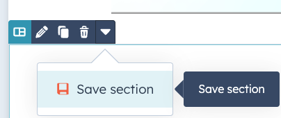
From there select "Save section." You’ll be prompted to name your section and can then reuse it across any page built with the Elisity_2025 theme.
This is especially helpful for maintaining consistency across landing pages and reducing setup time. Once saved, your custom section will be available under “Saved Sections” in the HubSpot editor.
Custom Modules can only be accessed when you are editing a page with the Elisity_2025 custom theme applied to it. All custom modules use the Elisity custom theme, Elisity_2025.
You are not able to find custom modules or saved sections on legacy pages that do not use the custom theme. However, legacy pages can be moved to the custom theme to apply the new navigation and access custom modules and sections.
Once you’re in a website page within the Elisity_2025 custom theme, you can:
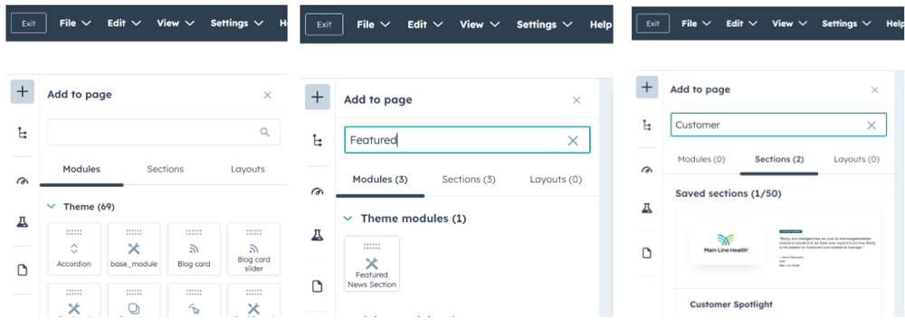
1. Click the (+) Add icon in the to left corner of the side menu
OR
2. hover on the page in the area you’d like to add content and Click (). A side menu will pop up on the left side of the page
- Click the Modules OR Sections tab depending on what you’d like to add to the page.

1. Scroll through the list of Theme modules to find the custom module you'd like to add (image 1 below).
OR
2. Search for the name of the custom module OR saved section you want to add, in the side-menu search bar (see search bar images below).

The theme colors defined in colors.css
- deepblue: #053242
- elisity-green: #0B6280
- newblue: #65F1FC
- true-blue: #54B9F1
- easy-green: #B5FC7B
- gray-text: #6A6D77
- gray-tag: #E8E8E8 (ONLY usesd as a tag color on Featured News & Resources modules)

This is a headline H1.
This is a subheadline H2.
This is an H3.
This is an H4.
This is body/paragraph text.
| Style / Class | Font Size (Desktop / Tablet / Mobile) | Text Weight | Text Color | Typical Use | Defined In |
| h1 | 65px / 44px / 32 px | Semi-bold (600) | Black | Main page titles | overrides.css, colors.css |
| h2 | 42px / 38px / 32px | Semi-bold (600) | Black | Section headings | overrides.css, colors.css |
| h3 | 36px / 24px / 24px | Medium (500) | Black | Sub-headings | overrides.css, colors.css |
| h4 | 32px / 24px / 24px | Medium (500) | Black | Smaller section heading | overrides.css, colors.css |
| paragraph (<p>) | 16px | Regular (400) | #6A6D77 | Body copy | colors.css |
Styled for primary calls-to-action, the .cta class, contained in container.css , is used across modules and layouts to guide users toward the next step. Button text, link, and color can be customized. Hover states shift background and border color depending on theme.
You can find this button listed in modules as CTA


- Padding: 9px top/bottom, 24px left/right
- Font size: 16px
- Border-radius: 8px
- Border: 1px solid (visible on buttons that default with borders and button hover states)
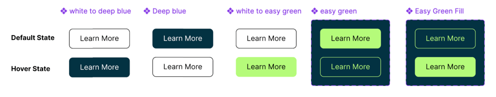
Button Styles & Default/Hover States
- White to Deep Blue
- CSS Class: .clear-to-deep-brand
- Default: White background, black text, black border
- Hover: Deep blue fill, white text
- Deep Blue
- CSS Class: .deepblue-theme
- Default: Deep blue fill, white text
- Hover: White background, black border, black text
- White to Easy Green
- CSS Class: .white_to_easy_green
- Default: White background, black text
- Hover: Easy green fill, black text
- CSS Class: .easy-green-brand
- Default: Easy green fill, black text
- Hover: easy green outline, easy green text
- Easy Green Fill
- CSS Class: .easy_green_fill
- Default: Dark blue background, easy green border and text
- Hover: Easy green fill with black text
Eyebrows
Eyebrows can be added using the Eyebrow Text module or are often included within saved sections that already feature an eyebrow by default.

Styled for contextual labels that sit above headlines, the .eyebrow class, contained in container.css, is used across modules to add meaning and hierarchy.
Eyebrows help categorize content such as features, use cases, solutions, industries, or content types. They provide lightweight context and help guide users through the page structure.
Eyebrows appear as inline text with pill-style padding and customizable theme colors pulled from the brand palette. You can adjust the theme (color) in the sidebar settings when the eyebrow is selected.
Note: As seen in the solution pages, the Red Outline style is often used alongside Easy Green to visually pair a problem (red) with its solution (green) within split sections.
- .eyebrow Styles
- Padding: 4px top/bottom, 16px left/right
- Font size: 14px
- Line height: 18px
- Border-radius: 50px
- Border: 1px solid (removed in some themes)
- Display: inline
Tags
Tags use the same styling as eyebrows and are not a separate class. They appear as short, inline labels used to highlight or categorize content. Tag text is fully customizable.
You’ll only see tags used in the Featured News and Resources modules. In Resources, tags help categorize the content type, such as Blog, Product, New, Trending, or Interview, making it easier for users to scan and filter content.

Images support brand storytelling across modules like Resources, Featured News, and Product Tour (to list a few). To keep layouts consistent, it’s important to follow recommended aspect ratios and upload optimized files.
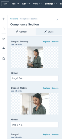
Many modules display the correct aspect ratio directly in the content editor sidebar when replacing or uploading an image. Always refer to that first. If no aspect ratio is listed, upload a test image and preview it in both desktop and mobile views to confirm it displays properly. (See image below of Compliance module).

Verified Aspect Ratios by Module
- Hero
- Full background: 16:9 (standard: 1600px wide x 500 pixels tall)
- Platform image only: 5:7
- Featured News Section: 4:3 (landscape)
- Card Reveal: 1:1 (square)
- Rotating Testimonials: 4:3
- Rotating Feature: 2:1
- Integrations Section: use SVGs
- Ladder Image: 5:3 (
- Product Tour: 16:9
- Rotating Testimonials Module: 4:3 or 3:2 (landscape)
- Compliance Section
- Desktop Image: 3:4 (portrait)
- Mobile Image: 4:3 (landscape)
- Resources Module
- First Image: ~8:3 or 11:4 (wide banner-style)
- Tip: In Canva or other design tools, use 1100 × 400px or 1650 × 600px for a clean 11:4 frame. The ratio doesn’t need to be exact, but keeping it close will preserve alignment and avoid cropping.
- Next 3 Images: ~4:3 (landscape)
- First Image: ~8:3 or 11:4 (wide banner-style)
Assets such as logos, icons, background images, and illustrations are stored in the File Manager, typically organized within the Assets folder. You can access them by opening the Design Manager or navigating directly to the File Manager in HubSpot.
For the 2025 website update, all current assets are housed in a Content > Files > in a folder titled "2025 Website", with subfolders that include:
- Backgrounds 2025
- Branded Photography 2025
- Customer Images 2025
- Documentation Page 2025
- Downloadable Assets 2025
- Eyebrows + Tags 2025
- Icons 2025
- Integration Overview Page Images 2025
- Logos 2025
- Platform Images 2025
- Preview Link Images 2025

Assets are used across modules and themes to maintain consistent brand visuals. When editing a module that includes imagery, you can replace or assign images by selecting from these folders or uploading new ones.
To check if an asset is being used:
In the File Manager, click on the asset. A pop-up window will display metadata, including "Used in" references that show where the asset appears. For example:

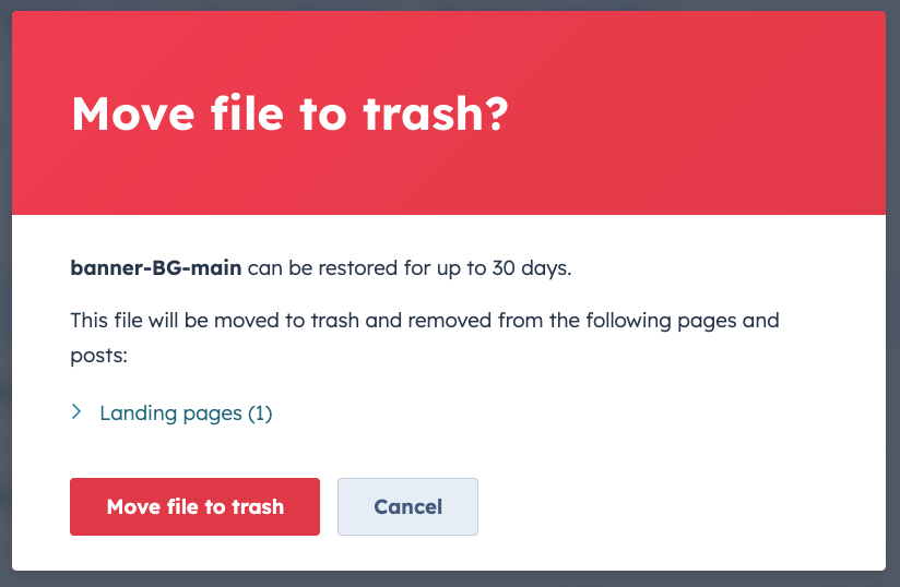
If no usage is shown, the same pop up will say "This file is not used anywhere in live CMS content. It is safe to move to trash."
Tip: Use clear, descriptive file names (e.g. logo-primary.svg, icon-lock.svg, background-product-01.jpg) to keep files searchable and reduce accidental duplication.
What it is:
The preview image appears when a page link is shared (e.g. Slack, iMessage - see example below, LinkedIn, social media).

Recommended size:
- 1200 × 630px (EXPORT AT 2x the size)
- Aspect ratio: 1.91:1
- Format: JPG or PNG
- Max file size: under 300K
How to set it in HubSpot:
- Open the page in the editor
- Go to Settings
- Scroll to Featured Image
- Toggle it on if it’s off
- Upload your image and click Update Page
Why it matters:
Without a set image, platforms may pull a random or broken preview. Adding one improves branding, trust, and clickthroughs.
In HubSpot, a theme refers to the collection of styling rules and layout files that define the look and feel of your entire site. Instead of styling each page individually, themes let you apply global settings, like fonts, colors, spacing, and buttons, all in one place.
When you change a theme setting, it automatically updates everywhere that setting is used across the site.
Elisity uses a custom child theme called Elisity_2025, which is built on top of the parent theme, Neambo Act3. This setup allows the site to inherit the core Neambo Act3 styles while applying additional, custom design rules for Elisity.
4.21 Navigation
The global navigation is managed in the Global Content Editor. It uses a dropdown mega menu format that can be easily edited.
To add or update a dropdown item:
- Go to the Global Content Editor
- Click into the menu section you want to edit
- Select the Dropdown to open and edit its items and links

Creating a new page
To create a new page using the Elisity_2025 custom theme:
- Navigate to the Pages section in HubSpot.
- Choose either Landing Pages or Website Pages, depending on your goal:
- Landing Pages are typically used for campaigns, gated content, or tracking conversions and may have minimal navigation.
- Website Pages are used for core site content like product, platform, or company pages and include global navigation and footer.
- Select blank.html as your template, this will automatically apply the Elisity_2025 theme, including the updated navigation and footer components.
How to confirm the theme is applied:
In the list view of pages, look for the Theme column (furthest right column at the top of the table). This shows which theme each page is using. Make sure your page lists Elisity_2025 as the theme. If it says "No theme" or the theme listed is incorrect, edit the page and reassign the correct template under the Settings > Template section.
⚠️ ALWAYS duplicate and do a test page before moving pages from Act3 Child to Elisity_2025 to test final implementation, layout, and potential bugs. This ensures content integrity and layout accuracy before replacing the live version.
Tip:
The blank.html template provides a clean starting point while maintaining theme styling and functionality. Add prebuilt Saved Sections or Modules to build your layout.
H1 Headlines in Hero
Sometimes H1 headlines can appear hidden under the navigation bar. This usually happens when there's not enough top padding applied on the hero section.
✅ Fix: Add padding-top: 150px to the top-level container or section, usually accessible in wrapper or styles tabs in the side menu.
⚠️ Always test mobile/tablet view as well! Sticky nav behavior can differ across breakpoints.
Updating Backgrounds
Backgrounds are applied at the section level, not inside individual modules.
To change a background:
- Hover over the section (not the module).
- Click Edit Section.
- Navigate to the Background tab and adjust the color, image, or gradient.
Image Guidelines for Backgrounds
- Recommended size: Minimum 1600px wide for full-width backgrounds (ideal range: 1600–2400px wide).
- File format: Use .jpg or .png (transparent background) for images and .svg for graphics with transparency.
- Compression: Thought Hubspot automatically compressed images, keep file size under 500 KB to reduce load time (use TinyPNG).
- Focal point: If using photos, place important content (e.g., faces, branding elements) near the center to prevent cropping on different screen sizes.
- Avoid text in background images unless absolutely necessary — use live text for accessibility and responsiveness.
To avoid images looking stretched, cropped, or misaligned, it’s important to use the correct aspect ratio. You can calculate the aspect ratio by dividing the image’s width by its height, then comparing that number to common ratios like 1:1 (square), 3:2 (landscape), or 8:3 (banner).
For recommended image ratios by module, see the Verified Aspect Ratios by Module section.
How to Calculate Aspect Ratios
- Divide the width by the height of an image to get a decimal.
- Compare the result to common ratios (see quick reference below).
- Use this to confirm if your image fits the recommended layout.
Example:
- Image size: 1200 × 800
- 1200 ÷ 800 = 1.5
- 1.5 = 3:2 → This image has a 3:2 aspect ratio
Common Aspect Ratios
- 1:1 = square (e.g. 800 × 800)
- 3:2 = landscape (e.g. 1200 × 800)
- 4:3 = more classic photo ratio (e.g. 1200 × 900)
- 3:4 = portrait (e.g. 900 × 1200)
- 8:3 = wide banner-style (e.g. 1600 × 600)
Tip: In Canva or other design tools, you can set custom dimensions using these ratios directly to create correctly sized images from the start.
This usually happens when there’s too much text in the headline or body. When that happens, the card grows taller and adds extra white space below the image, which throws off the layout balance.
The amount of text you can use depends on two things:
- Whether the default icon (SVG) is kept or removed
- How long the headline and body text are
If the icon is removed (more room for text):
-
A short headline (up to ~110 characters) and short body (up to ~275 characters) will fit cleanly.
-
If the body is long (up to ~325 characters), the headline should stay shorter—around 80 characters or less.
-
If the headline is long (up to ~110 characters), the body should stay under ~220 characters.
If the icon is kept (default layout like on the homepage):
-
A short headline (up to ~80 characters) and short body (up to ~250 characters) works well.
-
If the body is longer (up to ~275), the headline should be kept short, around 60 characters.
-
If the headline is long (up to ~100–110 characters), the body should be limited to ~150–200 characters to avoid layout issues.
Quick definitions:
-
Short headline = about 70–80 characters (1 line)
-
Long headline = about 100–110 characters (2 lines)
-
Short body = about 100–150 characters (1–2 lines)
-
Long body = about 225–325 characters (3–4 lines)
Removing the icon gives the card more room to grow without forcing white space below the image.
How to Prep Images for Upload - General Best Practices
- Use Canva or a similar tool to create images with consistent dimensions
- Export images at 2x resolution (e.g. 1200×800px for a 600×400px space)
- Keep image file sizes under 500KB when possible
- Use JPG for photos, PNG for transparency, and SVG for icons or logos
- Add alt text to all images for accessibility and SEO
- Use clear, descriptive file names (e.g. resource-card-blog.jpg, compliance-desktop-3x4.jpg)
- Put like-files or page-specific files in folders to keep things organized
Images support brand storytelling across modules like Resources, Featured News, and Product Tour. To keep layouts consistent, it’s important to follow recommended aspect ratios and upload optimized files.
Tip: Many modules display the correct aspect ratio in the right-hand sidebar when you go to upload or replace an image. If no ratio is listed, upload a test image and preview it on both desktop and mobile.
Custom module missing?
If a custom module isn't showing up in the Modules panel:
✅ Ensure the page is using the Elisity_2025 child theme. Custom modules are only available on pages assigned to this theme.
✅ Double-check you're using the correct template, like blank.html, which loads the full theme environment.
✅ Reference Files:
The full theme file structure, including CSS/JS assets and image assets, can be found in the elisity-theme-custom directory.
⚠️ If you don’t see the module after confirming the above, try refreshing the page or reassigning the template. If it still doesn’t appear, contact the dev team to confirm module registration.
To resolve this:
- Remove the background from the module
Apply the background to the section instead - This ensures the layout stays clean and aligns with the theme’s spacing rules.
See Section 2.1 – Custom Modules for more detail on this fix.
You can save a group of modules as a custom Saved Section. See full instructions here.
Page Not Styled Correctly?
If the page layout or styles look broken or incorrect:
Quick Troubleshooting Checklist
- Check the applied theme
Make sure the page is using the Elisity_2025 theme. In the Pages list view, look at the Theme column to confirm. If it’s blank or incorrect:- Open the page.
- Go to Settings > Template.
- Reassign the template to blank.html under the Elisity_2025 theme.
- Clear browser cache or do a hard refresh
Sometimes outdated CSS is cached. Use Cmd + Shift + R (Mac) or Ctrl + Shift + R (Windows) to reload the page with fresh styles. - Check for unpublished theme changes
If recent theme edits were made in Design Manager, make sure all files have been published. - Make sure the right modules and sections are used
If older modules or sections from ACT3 Child or another theme are still on the page, styling issues can occur. Use modules and saved sections from Elisity_2025 only. - Confirm global styles are loading
If layout or fonts look totally off, CSS may not be loading properly. Check with dev to confirm the theme’s CSS files are linked correctly.


